Case study / UX — Indeed
A system for collecting job preferences
Project overview
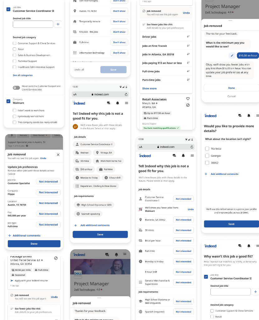
The #1 complaint from job seekers on Indeed is that they see too many irrelevant jobs. So, we redesigned Indeed’s fragmented job match feedback moments into a cohesive data collection system that improved job recommendations.
Lead UX Content Design, Indeed
- → UX Research
- → Content Design
- → Stakeholder Alignment
- → UX Copy & Data Lexicon
- → Design System
Key results
Collected more accurate data
- 24% increase in data collection (18% dislikes, 5.8% positive preferences)
- More data coverage let data science test new ways to improve job matching models
Improved job matches
- 6% increase in job applications from users who submitted preferences
- 9% reduction in opt-outs from job match emails
- 4.2% reduction in job match email tickets
Sped up product releases
- Components and documentation sped up design and release of new collection UX
- A shared data lexicon streamlined matching-model maintenance and iteration
01 / Problem
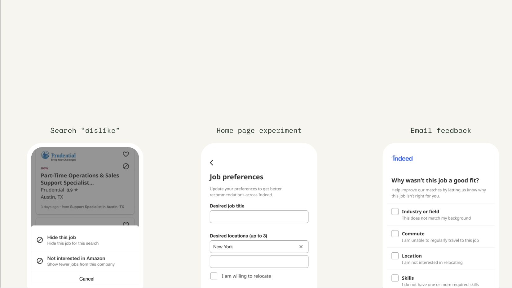
Indeed tried to address the issue by collecting feedback on irrelevant jobs, but each team shipped a different solution.
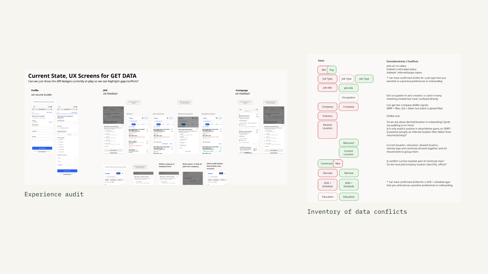
02 / Audit
It was confusing for users and overloaded Indeed’s job matching engine with an incomprehensible mess of conflicting data.
03 / Approach
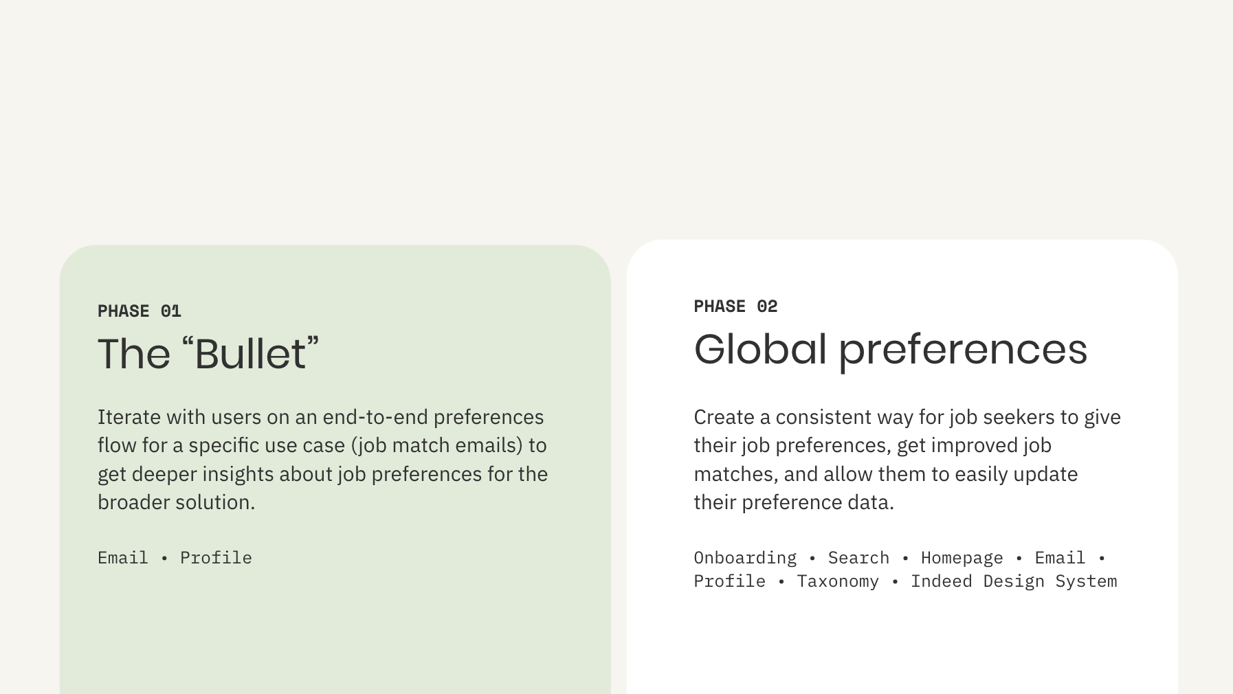
We led a design sprint to align product leads on an MVP before turning those learnings into a platform-wide system.
01 / Design sprint
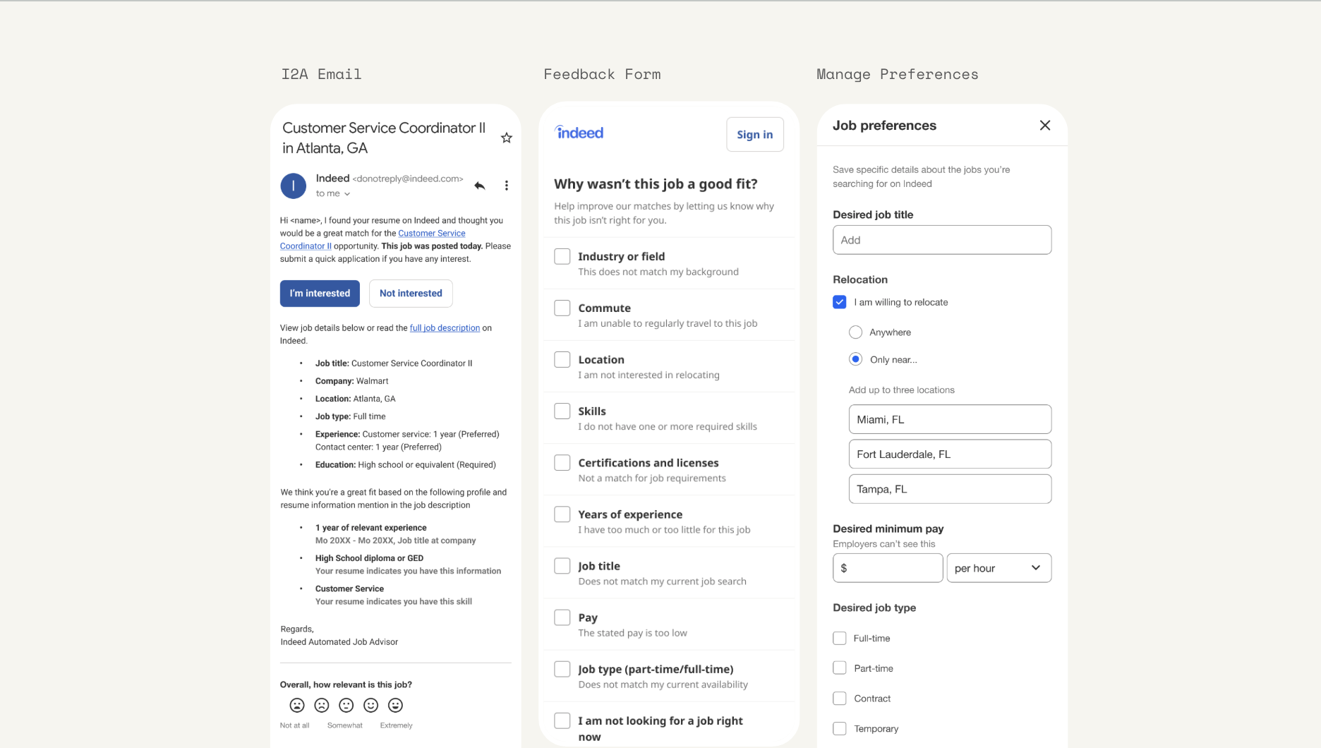
This 3-screen flow involved 7 product teams and multiple VPs with diverging priorities who would drop in intermittently.
We selected the Invite to Apply (I2A) job match email and feedback flow because it had the most engagement—and complaints—so we could test and learn quickly.
02 / System
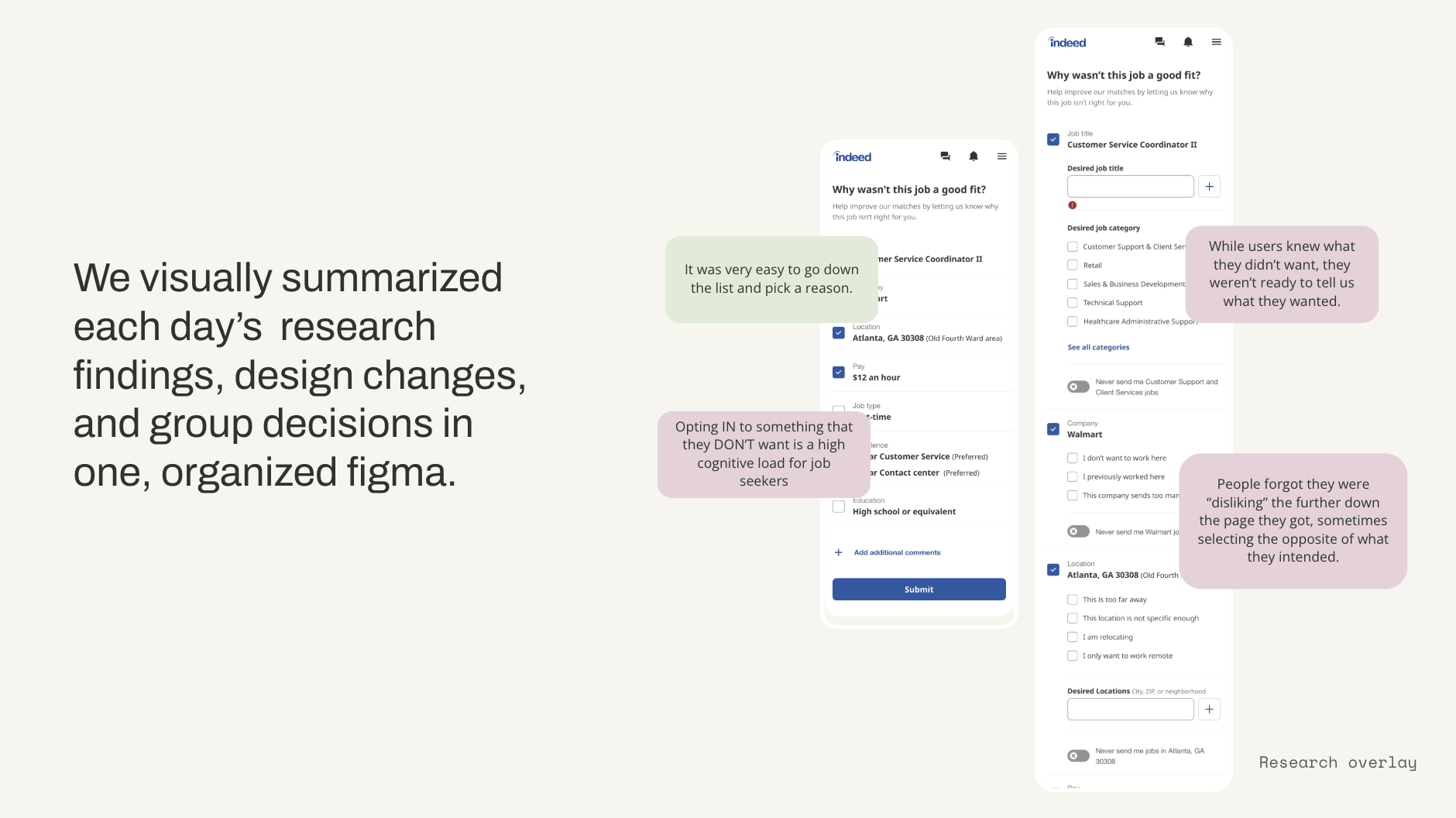
We visually summarized each design exercise, handoff, and roadmap decision in one clear system.
The map made the work legible across product teams and gave leaders a shared view of how preference collection should evolve.